Living – Bookcloud

By: Marit Coehoorn
Strengthen community feeling by giving neighbors a trigger for personal contact.

By: Marit Coehoorn
Keywords: Living, community, neighborhood, sharing
Final presentation poster: Click here

Design Goal and Interaction vision

Strengthen community feeling by giving neighbors a trigger for personal contact.
The interaction should be natural, effortless, open and lively. It should feel like ‘a moment of serendipity’: an unexpected but fortunate discovery of a shared interest, feeling, thought or experience.

Research Explorations

The initial research in different neighborhoods showed that a lot of people experience their neighborhood as being too anonymous. By handing out senzitising booklets and conducted a few interviews, I discovered people would like to have more contact, but don’t have a reason for this. Nowadays, people can connect anywhere and anytime, decreasing the need for a social neighborhood. This makes people feel less at home and decreases their sense of belonging.

With a small-scale sharing system in my own neighborhood, I discovered people love to share books: they are passionate about sharing something they liked, and also enjoy reading messages of others. Contact with neighbors was indeed established in a natural and exciting way.

A one-week test of the system in a student complex, showed they all love the initiative and believe it would decrease anonymity, but many students read too little or are too busy to participate.

Design Explorations

My initial design direction was about creating the feeling of sharing something, such as having a shared goal, experiencing a similar feeling together, doing an activity together and/or experiencing team spirit.

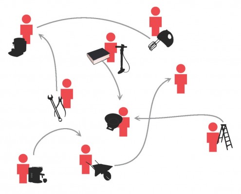
Next, I decided to focus on establishing personal relations within the neighborhood. I thought of a system in which people can share tools with neighbors: There would be a website for people to place tools and for people to request tools.

To trigger a more personal conversation, I focused on just sharing books. This could be an online system, or a physical system in a hallway. Instead of placing the books in the hallway, I let people write a note about a books, so others can come by their homes to borrow.

Final Design

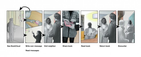
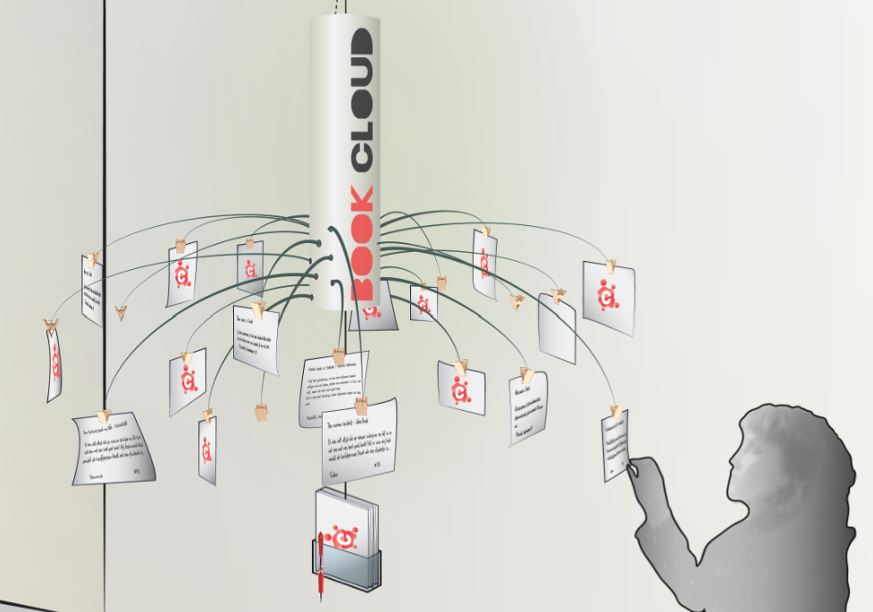
The BookCloud is a sharing system with which neighbors can share their books with one another. The BookCloud hangs in the hallway of a flat. Neighbors can write a short personal message (in which they recommend a book of theirs) and hanging this in the BookCloud. They read each others’ messages and are triggered to visit a neighbor and borrow a book.

The contact moment is established naturally, and gives people the opportunity to get to know each other better.

By having contact and sharing experiences, neighbors get connected. This increases the feeling of belonging to your neighborhood and makes people feel more at home.



Living – Need a shift?

By: Joep Deiman
Providing a temporary shift within the city for working people to get an engaging moment.

By: Joep Deiman
Keywords: Living, controlling, relaxed, effortless

Design Goal and Interaction vision:

Providing a temporary shift within the city for working people to get an engaging moment.
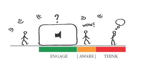
A Sudden shift of environment or perspective; from irritating noise to comfortable/reassuring sounds.

Research Explorations:

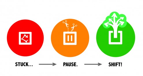
My first goal was ‘Escape within the city – getting away from the routine of daily life’. I decided to do a Context Mapping session with a target group I thought had the need of an escape: people who are working behind a desk all day. My goal was to get a clear view on the latent thoughts of these people when they thought of their work, focusing on the lunch break. This session gave a lot of insights; during lunch break there is a need for ‘rest’ or ‘(social) interaction’. My participants thought ‘escape’ was too negative. Words like ‘pause’, ‘break’ and ‘shift’ suited better. I continued exploring the context by searching for existing solutions, talking to the target group a lot and via design explorations.

Design Explorations:

I did a lot of design explorations by drawing and brainstorming. Especially the brainstorm sessions with a couple of student from our studio were very generative and useful. While designing, first the focus was on passive objects to fulfill the need of rest. Then I decided to explore more in the direction of interactive products that make people aware of the noise surrounding us. I came up with a ‘Tunnel’ that played with sound. To evaluate different concepts with sounds, I tested some of them with a small group to gain feedback. Eventually I wanted to avoid an imposed interaction and tried to return to an object people can use when they want/need to. The final concept was evaluated by making all kinds of scale models that were used in a stop motion movie. This was a very effective way of testing the imposed interaction without building large prototypes.

Final Design:

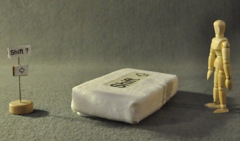
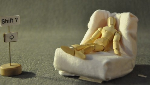
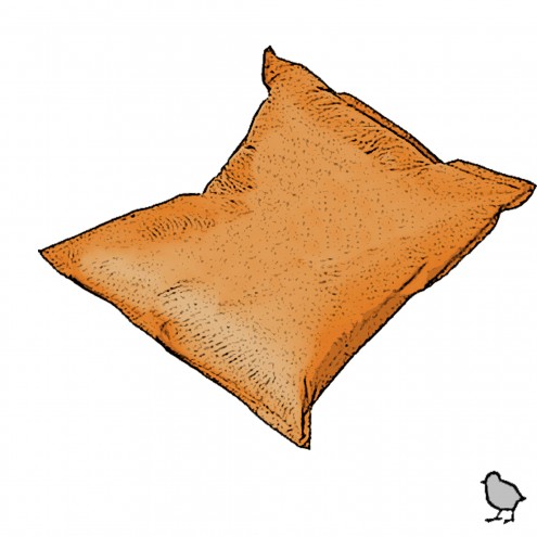
The final design is a big and soft chair in the shape of a Shift-key placed in for instance the canteen of an office. When someone needs a silent moment during lunch break, s/he can take a relaxing seat on the Shift. If someone wants to take a seat in the Shift, the key-shape will transform into a chair. Once the person is seated, s/he will be embraced by the chair, especially around their head. It will block surrounding noise and play the reassuring sound of birds.


Living – Delft Stories

By: Nur Findik
Shorten the adaptation process of new comers by increasing their connectedness with the local people.

By: Nur Findik
Keywords: Living, Social Places, Collaborative, Inspiring, Open, Sharing
Final presentation poster: Click here

Design Goal and Interaction vision:

The goal of this project is to shorten the adaptation process of new comers by increasing their connectedness with the local people. The interaction vision was `Imece Culture` where, in small villages, all residents are supposed to take part for the general needs of the village collaboratively. (Such as school building, wedding ceremonies, etc)

Research Explorations:

First research exploration started with a context mapping study with Dutch and International students. The goal was to understand what their common or different expectations are, in terms of social life and their interaction with each other. Almost all of Dutch students described their communication with internationals either by being a group mate in a project or helping them with some survival issues such as places to eat, accommodation, transportation etc. On the other hand, their ` needs and desires for an ‘ideal social space’ remain similar. The keywords that they used for this space involve the words such as open, friends, relax and easy. At the end of the research, I aimed to make design explorations on what kind of special moments do they share with each other apart from the survival issues.

Design Explorations:

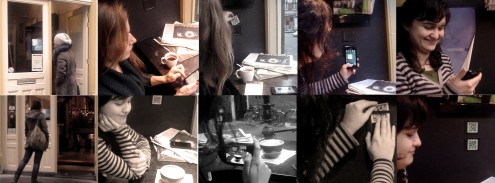
First design experiment aimed to understand how local people would respond to share their personal stories or advices related to Dutch culture if they were asked by new comers. This experiment provided a good insight about the context and the interaction. I created funny anonymous questions from new comer’s perspective related to Dutch Culture. Questions were located on the tables in a restaurant for 4 hours long. It was a good moment to answer questions while they were waiting their meal. And most of the answers were also in a very funny way as expected. As a last step of exploring the qualities of this story sharing activity; I tested taking the pictures of special moments, items or activities and writing about them by using an application. QR code tagging tests also gave nice insights for further development such as using stickers or post stamps on larger places like walls.

Final Design:

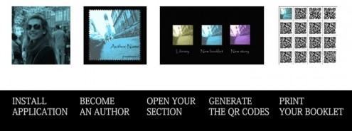
Delft Stories is a community that aims to publish a year book consists of different stories written by the citizens of Delft. By installing the Delft Stories Application, local people and new comers create personal library and QR Code booklet. Each QR code is connected to one story url link which is editable by the author of the story. As people capture their stories and save in the library, they are able to leave these stories via printed QR codes among different spots in the city .Those spots are usually restaurants, cafes and bars, where people can leave or scan stories on the walls or tables. This way, new comers have chance to get nice tips about specific activities, places, or get inspiration by learning more about local activities from local people`s point of view .


Work 2020 – Focus

By: Felipe Escobar
Help flex-workers from the year 2020 live a more balanced life in a world in which there is constant competition for their attention.

By: Felipe Escobar
Keywords: Work 2020, Digital Technology, Balanced, Gradual,

Design Goal and Interaction vision:

Help flexworkers (freelancers) from the year 2020 (Generation Y) live a more balanced life in a world in which there is constant competition for their attention. The interaction should be like a cigarette or coffee break, reminding you of the break you need to do by a craving.

Research Explorations:

The method initially was done through literature review of forecasts and trends for work and society in the year 2020, after that the method used consisted mostly of observational research and interviews. In the initial stages it was developed with different users, but for testing design solutions the same user was both observed and interviewed afterwards. The goals were to find insights on how people work that could be applied in the year 2020 and the usage/appeal of the design. The initial stages were discussing findings from literature and it was identified that user’s had a lot of different things to take care of during their working time. Later it was tested if the solution should be physical or software based and findings proved that physical solutions, if properly used, were preferred by the user. Then in other tests, users found the solution to be useful but remarked on the functioning of the object which was tweaked as much as possible to correct accordingly.

Design Explorations:

There were 5  tests done with different prototypes, each one building up on the knowledge gained from previous iterations. The first test was done with two versions, one to test a software based solution and the other a physical approach, the software based was found to be too obtrusive and would be disabled. The following tests were done to identify the directions that would be taken, first user’s stated that although colors gave them an overview, the pressure felt constant and they had no feedback over which area was unbalanced. This was later implemented in another test in which different activities were given to users and they had feedback with both pressure and color.

Final Design:

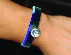
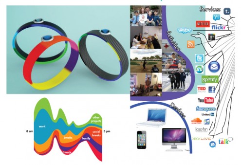
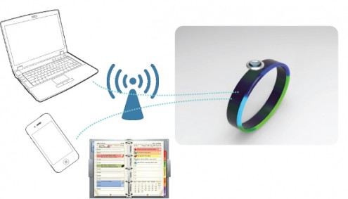
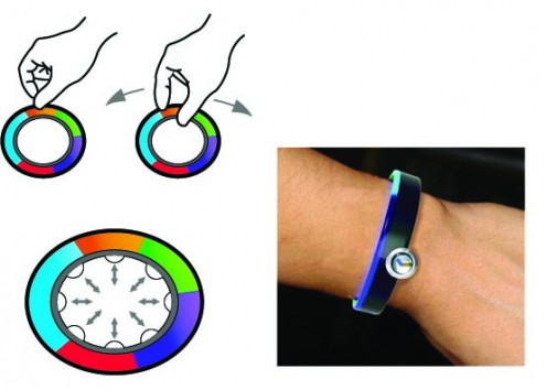
The final design incorporates self-tracking into daily life. The design consists of a watch that keeps track of the user’s activities throughout the day and helps give an overview of how much time they are spending on each kind. This will help plan and adjust their activities and give an overview of their productivity (defining productivity as all elements in their life and not just those related to work). This information is gathered through technology by a clock, if the user spends too much time on an activity the wristband will constrict the user very lightly, causing mild discomfort until the user stops doing that specific activity. It will remind him like a craving or hunger that they needs to change activity.

Work 2020 – Pikpoke

By: Anna Pestaloza
Give people working as self-entrepreneurs an easy and direct way to identify and recognize each other.

By: Anna Pestaloza
Keywords: Work 2020, Communication, Digital Technology, Spontaneous, Curious, Effective
Final presentation poster: Click here

Design Goal and Interaction Vision:

“I want to give people working as self-entrepreneurs an easy and direct way to identify and recognize each other, as people with whom they could have a useful exchange of ideas, to support their work and share their knowledge.”

I used the metaphor of “love at first sight” to better describe my interaction vision. I wanted to give to two people, participating to the same co-working event, the possibility of recognizing each other from distance, and feel a kind of attraction that could lead them towards each other.

Research Explorations:

At first I wanted to discover how self-entrepreneurs that work in the same space (co-workings) interact with each other. They had to draw and describe how their workspace was like and which kind of connections they made there in a workbook. After reading the booklets I had to adjust my design goal, since I discovered that the main problem was not to bond with the people working at the same co-working space, but with people they meet at events for co-workers and self-entrepreneurs. These events take place once a month and anyone can join them.

I went on with an online research on how you register to participate and how can you find meaningful collaborations in a small amount of time. I went to a co-working event, I gave some questionnaires around. I noticed that the tagging system that had been used to match profiles of people participating to the event was scary. I have also noticed that people were very afraid their descriptions could be misunderstood.

Design Explorations:

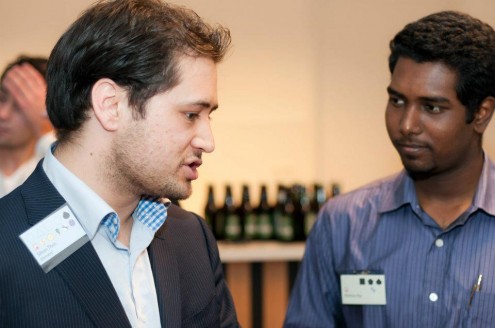
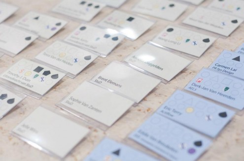
I tested a first prototype at the IOB event (Figure 1). I made some badges with a main shape indicating the main professional field of the person wearing it. I attached on the background shape some stickers of other fades, corresponding to different aspects of that main field. Feedbacks: people were happy to be able to personalize and make up their badges at the moment. Too many colors on the badges were confusing, the informations were not clear. A lot of people are colour-blind, shades are difficult to distinguish.

The second test was carried at the Career Event at YesDelft. I worked with the staff to make personalized badges for each participant, based on the questionnaires about their profession they filled in when they subscribed for the event. The background color differentiated students from companies, the shape stood for the professional field and the icons for the skills. Feedbacks: the badges worked well as icebreakers, icons and shapes were too difficult to understand, having something that tells too explicitly what you do could ruin the concrete interaction.

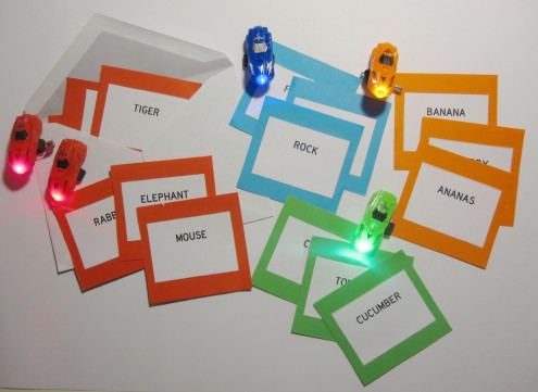
Third exploration: a game to test the efficacy of the product as an ice-breaker.

Final Design:

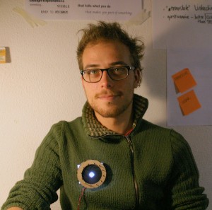
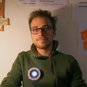
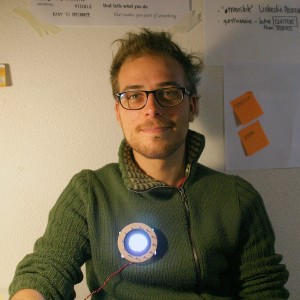
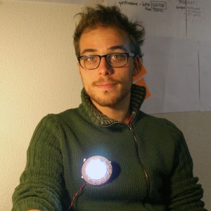
Pikpoke is an electronic badge that will help you to find people to share knowledge with, based on the infos about yourself you registered in it. Pikpoke will be your wing-man, the one that gives you the hint to start talking to a person that you find interesting, but you don’t know how to approach. When it detects another badge that has similar informations registered in, both the badges lights up, giving to the people wearing them a hint to approach each other. The signal is not too explicit, it is just a light, so the two people will have to talk in order to understand what they have in common. The aperture or closure of the diaphragm is a way to concretely set the specificity of the search.


Work 2020 – MyMood

By: Ilaria Scarpellini
Improve the communication between team members, creating a higher level of comprehension and mood sharing.

By: Ilaria Scarpellini
Keywords: Work, clear, aware and comprehensive

Design Goal and Interaction vision:

I want the to improve the communication between team members, creating a higher level of comprehension and mood sharing.
I want the team members to be aware of each others’ conditions and be there at the right moment, like the X – MEN.

Research Explorations:

At the beginning y main research goal was that of investigating the effects of computer work on interactions between team members and fin interesting dynamics. After some observation sessions and generative sessions in collaboration with a couple of company I narrow down my research on the dynamics of questions and interruptions.

I tested a preliminary concept of alternative communication on workplace through role playing. I interview the users and gathered their opinions. I then evaluated my final concept in two ways.  A first test on 8 people to get an idea of how people attribute meaning to materials in relation to their temperature/texture. A second test with a prototype to resemble the real interaction interviewing the participants afterward.

Design Explorations:

At first I observed the current situation to get an idea of what to focus on. I explored some potential directions then went straight to the idea of introduce a new means of communication. At first my uncertainties where about what to communicate and how to do it.

I first focused on light feedback associated with a computer interface. Then I thought about a minimal solutions involving just interfaces. Then I did a step back e beginning to reinforce more and ore the idea of focusing on the product. The evaluation study deeply influenced my last decisions about the final outcome.

Final Design:

CONCEPT: The idea is to create a means to improve the quality of the communication between colleagues. The product aim is to enhance the connection between team members providing tactile feedback.

PRODUCT: The object is interactive and can be approached in different ways by the user. It is sensitive to touch and movement so to detect people’s level of concentration. At the same time it provides information expressing them through tactile feedback as vibration and warmth.

INTERFACE: The interface allows the users to exchange questions attributing priority to them. The software manages the output in relation to the amount and priority of the questions considering also your concentration level.

Digital Health – The nails project

By: Chen HAO
Creating a new way of interaction for chronic nail biters to enhance their biting experience.

By: Chen HAO
Keywords: Digital, Health, Tech, Animated, Joyous.
Final presentation poster: Click here

Design Goal and Interaction vision:

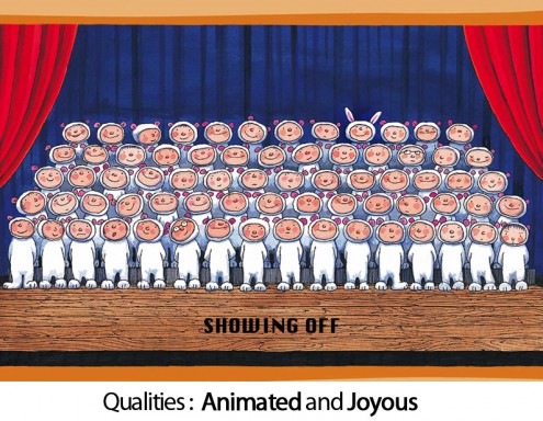
Creating a new way of interaction for chronic nail biters to enhance their biting experience, so that the can cope with their biting behavior. Interaction Vision: Showing off

chen hao interaction vision

Research Explorations:

My research exploration can be divided into 3 phases. The first phase was doing observation about the target group, which gave me the first impression of nail biting.  The second phase mainly focused on the literature research, which contained theoretical information (e.g. medical definition, how does this behavior come from, etc.) about nail biting and its relevant background (e.g. population, current treatments, etc.).

The information I collected from these 2 phases were mainly about the medical point of view, which made me believe that nail biting was a negative and self-mutilation behavior that needed to be prevented. However, my insights were changed after doing a series of face-to-face interviews, collage making and staying close with nail biters in the third phase.

I found that nail biting was not as negative as the doctor said; it was actually a kind of comfort that provides nail biters lots of supports. Therefore, how to enhance the biting experience was defined as my final direction.

Design Explorations:

Since my design goal was refined and clear after the research phase. I came up with several initial concepts and chose best 3 of them for the further exploration. The brief instruction and corresponding test are introduced below.

Concept 1: Let nail biters create personal rhythms and music while they are biting. Tested with a role-play video.

Concept 2: Just like playing a game with your nails, ‘a nail factory’ provides some small monster and scissors patterns on the nails, which kindly reminds the biter that he/she should bite by obeying some rules. Tested with a scenario and a rough prototype.

Concept 3: Nail biters can create personal paintings while they are biting. Tested with a detailed storyboard.

Most of the participants love these concepts and they were really appreciate that my concepts are in such a positive way. However, they wish the final concept could be personal and unobtrusive.

Final Design:

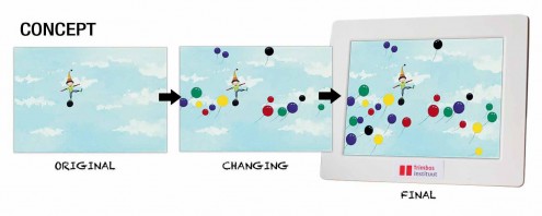
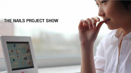
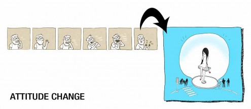
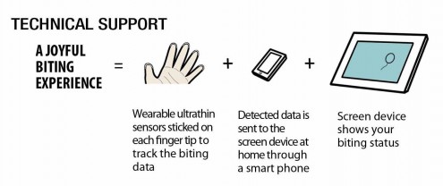
My final design was based on the Concept 3, which is a digital frame can record biter’s biting status everyday through an unobtrusive interaction. The original content of the frame is an animated image with a little boy standing on a balloon in the sky. Biter can choose different color balloons to represents each of their nails.

During the day, more and more balloons would popup and grow on the relative position in the image in accordance with the time biter bites the nails. Each balloon on the image indicates the time and frequency of certain nail that was being bitten during the day. A time line can help the biter to interpret their one-day biting status when needed.

Digital Health – Sleep-mate

By: Andre G Taris
Provide a better sleep through the use of a transitional sleeping object.

By: Andre G Taris
Keywords: Digital Health, Transitional sleep object

Design Goal and Interaction vision:

To provide a better sleep through the use of a transitional sleeping object [added comfort and reassurance]. The object assist in maintaining the optimum body temperature and position during sleep.

Research Explorations:

After formulating a solid research goal, data collection began where the experience occurs. In the bed room context observations of users going to bed or waking up (re-enactment). Go into people’s homes, talk to them while they are sitting on their bed.  Follow-up interview included the re-enactment of key interactions with the bedroom environment. Participants were actively engaged, collecting the required information in cultural probes. Stimulus session sheets were used to understand how the ideal experience translates into solutions. The final research stage involved a multi-sensory experiential prototype. Two participants were asked to use it for the night. Insights were documented in a follow up interview. Participants used the device in a small scale evaluation study, testing all relevant interactions. Observed participants setting mode and basic charging usability evaluation.

Design Explorations:

Initial concepts were generated from the cultural probes and other early research explorations. The first stage of design exploration involved a low fi mock up of the initial concept. Concepts were evaluated against the drivers discovered in the first research stage of the project. The data gathered from these sessions was analyzed and used to create a second experiential prototype. The two separate iterations of the concept allowed for further development of the temperature aspect of the design. This evolved into the final concept of which a final small-scale evaluation study was conducted. Insights gathered from the final model allowed for the development of a tandem online application that helped monitor and improve key interactions of the sleep experience, sleep and comfort.

Final Design:

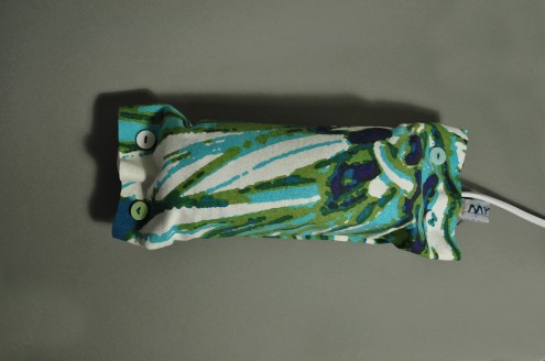
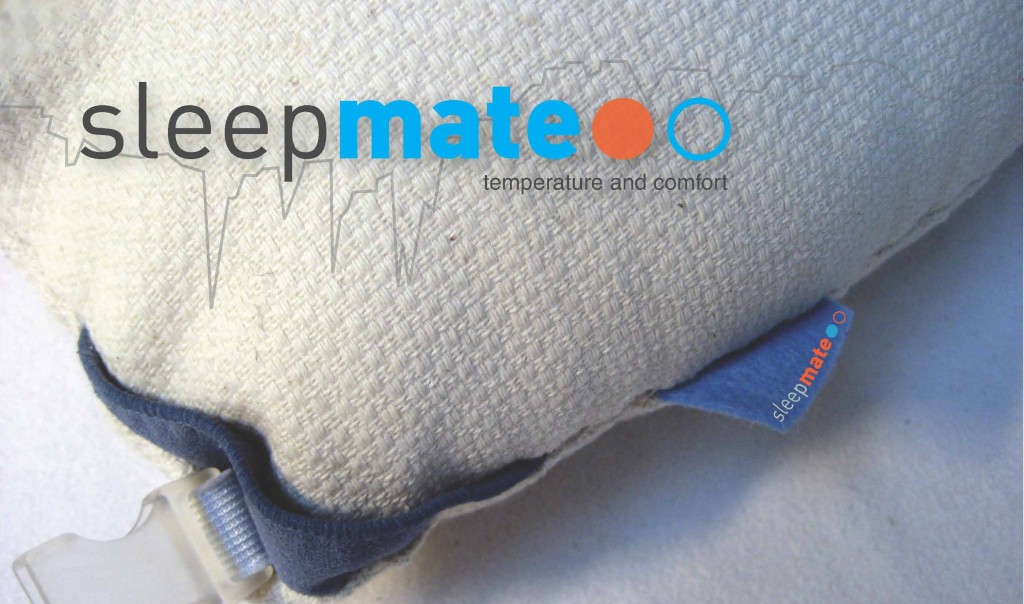
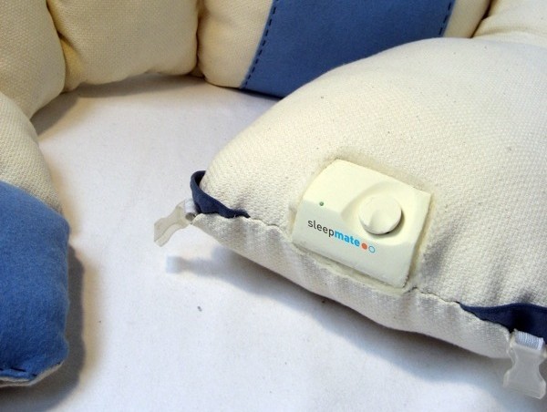
A physical companion, Sleepmate provides reassurance through object companionship. Like your favorite pillow, through the act of washing the cover, it ages over time. Able to regulate body temperature, the final concept learns the users optimum sleeping cycle temperatures and is operated in either winter or summer mode. No cords in the bed, it simply charges while you are awake. The Sleepmate is a smart device able to relay information on your sleeping pattern to an online application. Contact with the device warms the lower body using built in warming segment and thermostat. During the night the device keeps the body at optimum temperature and wakes the user with a natural reduction in temperature.

Mobility – Dare to stare

By: Jaap Gerritsen
Let train travelers waiting on the platform become more aware of and let them establish contact with the people around them.

By: Jaap Gerritsen
Keywords: Travel, Communication, Tempting, Exposing
Final presentation poster: Click here

Goal & Interaction vision:

Let train travelers waiting on the platform become more aware of and let them establish contact with the people around them.
Tempting awareness. Tempt people to look at others and tempt people to allow others to look at them.

Research Explorations:

Gain insight in the behavior of people waiting on or in trains in relation to the people waiting around them.

Phenomena: People don’t interact with others and try to distract themselves.

Observations: Most people travel alone. They are bored and look for distractions by using their phone/music player/newspaper/book or by looking around, mainly in the direction of the arriving train or the other side of the platform.

Context mapping and interviews: I sensitized participants about traveling and waiting, from the interview I learned about how/where people get into contact with others and who those others are.

Literature: General social behaviour in public transport/spaces.

Main conclusion: most people need a motive to start interacting with other people in public transport.

Design Explorations:

Mockup: Scale model of two facing platforms with people on it and a magnifying glass in the middle to visualize the effect and tension of seeing others and being seen magnified yourself.

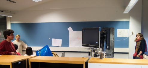
Test 1: Observe behavior of two groups in separate rooms connected through Skype using two large displays/webcams. Groups were first somewhat uncomfortable but ended playing games together. Participants were more comfortable not seeing themselves on the screen. http://www.youtube.com/watch?v=uB3UEe_Vwwk

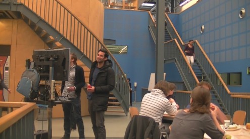
Test 2: Observe behavior and ask experience about seeing the faces of people also present somewhere in the same location on a Laptop and large display using webcam. People were attracted towards the screen, because of the large faces on the screen and a video effect on top of it. The also started looking around them to see where the images came from and wondered if it was real or fake. http://www.youtube.com/watch?v=mjGAvYHs3Y0

Final Design:

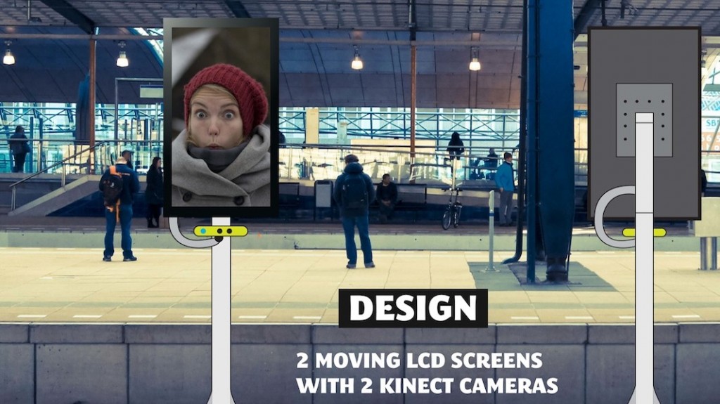
The final design consists of two large mobile LCD screens between the tracks of two facing platforms. Each LCD screen has an integrated Microsoft Kinect which captures and tracks the people and their movements. This data is sent to the other screen which zooms in on the person’s face. This way people’s faces from both platforms can be seen 7 times larger/closer on the other side. The LCD screens are automatically moving from the beginning of the platform to the end and stop when they’ve spot a person, follow this person for a moment and move on. The images on the screen attract the attention of other travelers curious where the image is coming from, while in the same time their face is being projected on the other screen.

Mobility – Infogarbage: Thanks in advance!

By: Federico Gabriele Trevia
Give passengers the possibility to give credit to cleaners’ work.

By: Federico Gabriele Trevia
Keywords: Communication, Awareness, Appreciation
Final presentation poster: Click here

Design Goal and Interaction vision:

I want passengers to give credit to cleaners’ work, in order to help them to feel more confident and appreciated during their working time.

Proactive Appreciation. Passenger should react in advance, behaving in order to influence directly cleaners’ work both on trains and in the stations.

Research Explorations:

One of the insights which I picked up from the appreciation research is the hug, which has become one of the focal points of my project: I wish the cleaners to feel a metaphoric hug from the passengers and from the whole environment in order  to make them feel appreciated.

To explain the results of my research, I presented three different aspects of the hug : a storyline that contains all the steps that actually characterize the real action (looking for the most suited to mirror the metaphor ) from eye contact to empathy; a “science’s corner” in which I described  the positive effects of a hug from a “chemical” view and what this involves (hormones produced and effects on behavior ); a short analysis on  what one can show hugging someone else.

Design Explorations:

Before getting to the final design I developed several concept and I made evaluate them first to my colleagues, then to unknown passengers at Delft Station and at Den Haag Centraal. This way I got suggestions, feedbacks and insights both from people already aware of what I was doing and from final unaware users.

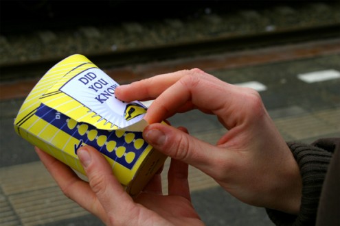
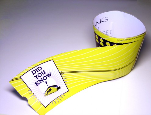
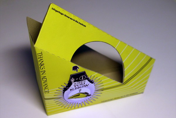
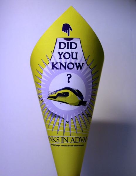
I also explored the branch of packaging design and overall the food packaging, to find the most triggering and newest solutions in order to evoke curiosity and surprise in the users. Finally I created a tactile interaction with the packaging that firstly should be explored and discovered to read the information and secondly squeezed and thrown away.

Final Design:

I came out with a simple concept based on the metaphoric effect of the hug which mixes graphics and information to make the passengers aware of the cleaners’ work.

What: impressive data on cleaners’ work (seen almost like superheroes) and suggestions on behaviors (how to help cleaners + recycling tips)

Why: basically both to give passengers guidelines to behave and sensitize them about cleaners’ work, as well as to make the cleaners feel more confident and able to get the help of passengers (everybody speaks, reads, learns about them – feeling the hug of the environment).

Where: in the station with disposable packaging of food like  Fries cones, coffee cups and sandwiches boxes.

Health Insurance – Pick-it-up!

By: Anne Heikamp
A product for people having Autism spectrum disorder and learning disabilities that will help in reducing fear for dentistry object.

By: Anne Heikamp
Keywords: Wellbeing and health insurance
Final presentation poster: Click here

Design Goal & interaction vision:

Designing a product for people having Autism spectrum disorder and learning disabilities that will help in reducing fear for dentistry objects

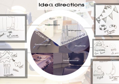
These people go to a special dental care practice and need help with the dentist visit. They need help with the preparation of this dentist visit and with changing context. For example, they find it hard when the dentist explains how to brush their teeth to apply this when they are at home. Pick-it-up! will help them.
Research and Design Explorations:

In my design process I conducted two main research studies. The first one was to gain more insight in the environment and to see the points of improvement. In the second research I tested my concept through observation, interviews and a user test.

I did a couple observations in the special dentist practice BCT Rijnmond. This is a dentist practice where they adapt every treatment to the patient. The observations helped me to understand the environment and to see if my concept worked. The interviews helped me to get more insights. People having Autism spectrum disorder and learning disabilities are sometimes hard to understand and talking to the mentor and dentist helps to clarify their thoughts and actions.

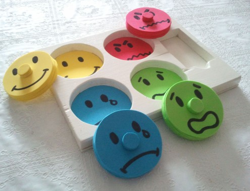
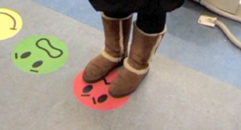
After conducting most of the research I changed a number of aspects in my concept after which I could start with testing the final concept. The emoticons have other expressions, the cards have another size and now have the ability to draw on and there are only big stickers of the emoticons at the dentist practice.

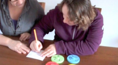
Lisa helped me with testing Pick-it-up! of which I made a prototype. Lisa really saw it as a game, which meant she was more concentrated. This made it easier for the mentor to prepare her for the dentist visit and explain every action. Lisa also liked expressing her feeling through the emoticons. It seems that when she knows what her feelings will be before the dentist visit really happens, that she is more relaxed during the dentist visit.

The final important fact I found out during my research is that the dentist is positive about the Pick-it-up!, because it helps transferring context from the special dental care practice to home.
Final design:

Pick-it-up! will help these people in three steps. The first one is the preparation where the board game is used at their home with their mentor. By going through every action they will experience during the dentist visit they will know what to expect and be more comfortable during the dentist visit. During this explanation of every action they can express their feeling by putting the emoticons in the board.

During the dentist visit, the second step, the dentist can refer to the emoticons through the stickers they will have in the treatment room on the floor.

The third step is the learning process. In this step the board is used again at their home with the mentor. The emoticons will help them with transferring the context. Now it will be easier to apply what the dentist told them, for example how to brush their teeth.

Health Insurance – Communicating with the doctor abroad

By: Anita van Schie
Enable travelers to communicate satisfyingly with foreign doctors.

By: Anita van Schie
Keywords: Health insurance, Travel, Smooth, Involved
Final presentation poster: Click here

Design Goal and Interaction vision:

Design goal: I want to enable travelers to communicate with foreign doctors in a satisfying way.
Interaction vision: By letting the conversation feel like a smooth team achievement.

Research Explorations:

The goal of the first research was to find out which problems or negative situations occur when visiting a doctor abroad and how they evolved. I used interviews, context mapping and a survey and participants were people who had experience with going to a foreign doctor and Dutch health care workers who had experience with foreign patients.

Most interesting result were that many people indeed had a lot of problems communicating to the doctor. They had not prepared for it or thought they would manage, but actually felt really uncomfortable at the doctor feeling not in control resulting in not trusting the medicine or treatment they had gotten.

I was surprised to find that doctors never seemed to use any extra tools to improve the communication. Talking to Dutch doctors I learned that they are often very busy and just do not have time to try to translate everything and feel it is the patients responsibility to be able to explain their problem.

Design Explorations:

Throughout my project I made different prototypes. Every prototype I tested with users and compared the results with my interaction vision. When they did not match, I improved the concept, made a new prototype and tested it again.

Findings with the first concepts showed for instance that only one user was in control of the conversation (patient ór doctor) instead of creating a feeling of teamwork, or that there was no clear structure in the pictures resulting in an overload of information instead of a smooth and quick conversation. Throughout all the user tests the pictures themselves were improved on clarity and the choice of important pictures was also based on the comments of doctors.

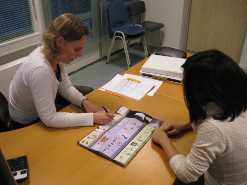
Final user testing at the SGZ in Delft with a real doctor and real patients, showed that the final concept did really help the users to communicate and creating the right type of interaction: a smooth team achievement.

Final Design:

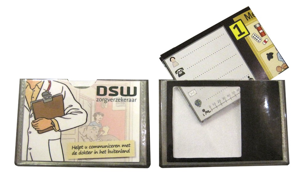
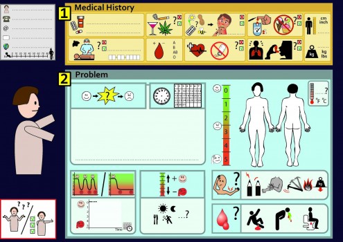
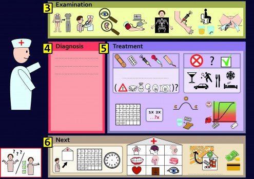
The final design is a communication tool. It is a poster with (medical relevant) pictures. When users travel abroad and unexpectedly need to visit a foreign doctor, they can use this poster to help them communicate. On the front side are pictures which can help the patient explain his problem to the doctor and communicate his relevant medical history.

This can be done by drawing on the poster, pointing at the pictures and use this to strengthen play acting. On the backside are pictures that can help the doctor explain what he is going to examine and what the diagnosis and treatment are. The pictures are structured in the natural order of the consult which helps to guide the users through the conversation in a smooth and quick way.

Child and MRI – The MRI box

By: Maria Arvidsson
Give children (5-8 years) the capacity to go through a MRI scan without anesthetics.

By: Maria Arvidsson
Keywords: Child and MRI, Health, Children, Colorful, Confidence, Involved
Final presentation poster: Click here

Design Goal:
”to give children (5-8 years) the capacity to go through a MRI scan without anaesthetics by preparing them and helping them and their parents stay balanced in terms of enhanced relaxation, motivation and focus ”
Interaction vision: Sense of freedom: Confidence and Control.

Research Explorations:
Research goal: ”To develop an understanding for the primary user and his/her interactions with the environment, while also learning more about the MRI/an unknown context, situational stresses and how to relax”.

Methods: Observations, Interviews, Context mapping, Literature research.

Results: Children are in their way of living, exploring and acting out very different from adults. They live very much in the moment and react strongly on parent reactions. Children often react to stress with fear and their perception very much depends on their developmental phase. Going through a MRI can be hard for children. The sound and the environment can be scary and it is difficult and boring to lie still for very long.

Design implications: Focus on helping and involving children and parents together, facilitating a trusting and open relationship, giving the child control, guidance, comfort and preparation in a secure environment.

Design Explorations:
An extensive research was backed up with further expert and user interviews at hospitals. An initial prototype was build according to the insights gained. The concept was explored and developed during testing’s and evaluations. The main idea was to in one product bring together all the main values I found important for children, in order to be able to cope with a MRI without sedation.

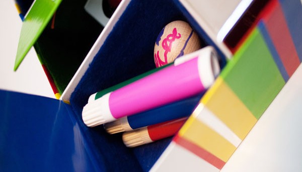
I spend a lot of time on improving the concept, and developing the objects in each of the daily pockets; both material and shape should fit with the theme of the days. I did tactility testing’s with children to evaluate material aspects and get inspiration. I interviewed hospital personnel and parents and used their expertise to improve the prototype. I finally tested the concept with a child and got positive feedback and many thoughts confirmed. I brought all the insights and changes into a final prototype describing the concept as a finished product.

Final Design:
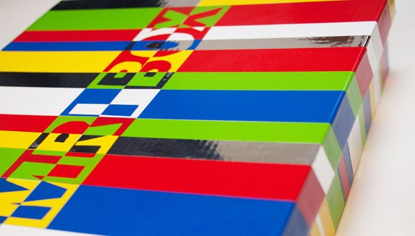
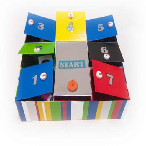
The MRI BOX – 7 days – 7 surprise objects – 7 exercises, a preparation tool for children going to a MRI.

About two weeks before the MRI the child will get a box home. It is his/her own MRI box providing all the information needed to prepare for the MRI. The box is a low-cost and low-tech product that helps the child prepare step-by-step to­gether with a parent. Each day during one week the child opens one pocket in the box. He/she will learn some­thing new through a small booklet and an exercise to do together with the parent. There is also a special booklet for the parents with more de­tailed instructions.
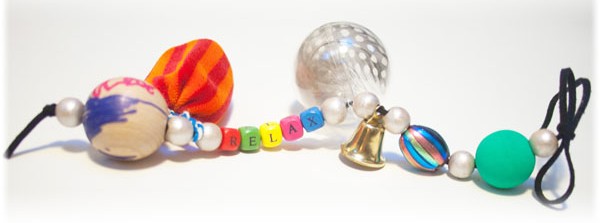
Every day is linked to a small object that will help the child remember what has been learned. The objects are collected on the memory chain. This chain is also brought to the MRI as a comfort, reminder and communication tool to the personnel.

Child and MRI – Pro Breather Meditation

By: Fawn Ellis
A holistic experience, including family, which reduces anxiety and the need for sedation for teen heart patients during an MRI

By: Fawn Ellis
Keywords: Child and MRI, Health, Social, Control, Fantasy
Final presentation poster: Click here

Design Goal and Interaction vision:

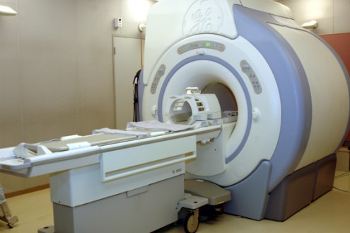
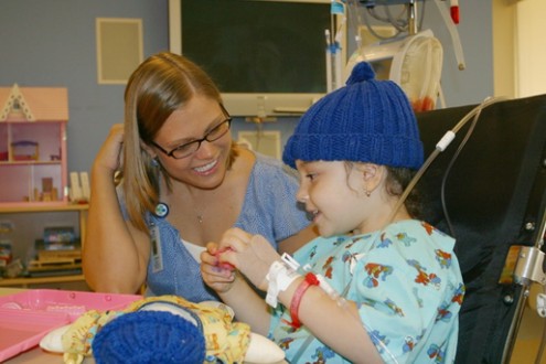
Teen heart patients must undergo sedation during the MRI, which allows nurses to take complete control of the heart to achieve a clear image. Sedation, however, tires the body & adds family stress. The design goal is to create a holistic experience, includes family, which reduces anxiety and the need for sedation. The interaction elicits what is important to teens: control, social relatedness  & fantasy.
Research Explorations:

To develop a meaningful product, I conducted an in depth literature search to understand how children make sense of their bodies, how chronic illnesses affect children and the family emotionally and dynamically, as well as calming and relaxing techniques for anxiety; breathing proved beneficial.

To get into the minds of teens, exploratory research was conducted. For this I visited the children’s science museum and a teen magazine section to observe interactions and what interests teens.  I also followed teens on facebook to see how they communicate and what has meaning for them.  What I found; relating with other teens & moving in packs, fantasizing about future outcomes and being in control were important factors.

Lastly, I met with health and meditation experts to observe, interview and partake in both an MRI and meditation. This allowed me to get a deep understanding of the  MRI and solution-based experience.

Design Explorations:

During the idea generation phase, I role-played with peers the intended interaction. The first prototype was also tested in this manner.  It showed I needed more feedback and clear definition of user actions.

In the interim, I spoke with a respiratory therapist, and meditation student to see if it would satisfy health industry & meditation needs. The outcome was positive.

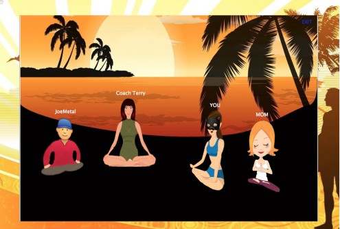
The second prototype was tested with 4 teens. Pro Breather was well received and only small changes, e.g. picking music, private family lessons, avatar definition, were needed to create a more personal connection.

Lastly, I tested the remote meditation lesson interaction via a skype phone call with 1 meditation instructor and 3 remote participants. The lesson was successful in achieving control, fantasy and social, however, to ensure future success, warm ups need to be in every lesson to open people up, visuals of warm up poses, setting up your environment and avatar interaction need to be further defined and developed.

Final Design:

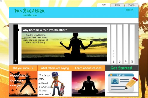
Based on my research findings, I developed, Pro Breather; online guided meditation lessons for teen heart patients.

Teens can participate in live meditation lessons, where they learn to control their heartbeat and enter into a fantasy based mental state. During the lesson, they can physically engage with participants and the coach by speaking through the computer. This allows teens to connect. Teens can further bond and receive support by inviting friends & family to the lessons via Facebook or Twitter. They can also meet and chat with other teenage heart patients who share similar interests. At the end of the lesson individual and group concerns can be shared and discussed.