By: Paula van den Boer
Keywords: being on call, midwives, soothing, sleeping ritual, gratefulness, work stress, releasing, clearing mind & balance
Tutors: Anna Pohlmeyer & Wim Schermer
Design Goal and Interaction vision
The design goal; Soothing an on call midwife before work stress gets in the way of a good night’s rest.
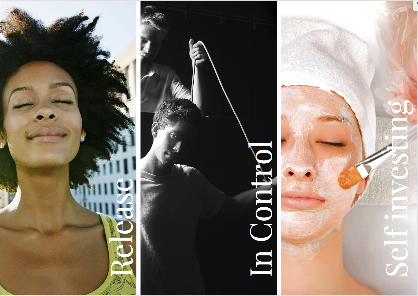
The interaction vision; Release, In control, Self Investing.
I want the midwife to feel like she can stand behind the starting block for her 24hr sprint, in stead of standing in tension in the starting block.
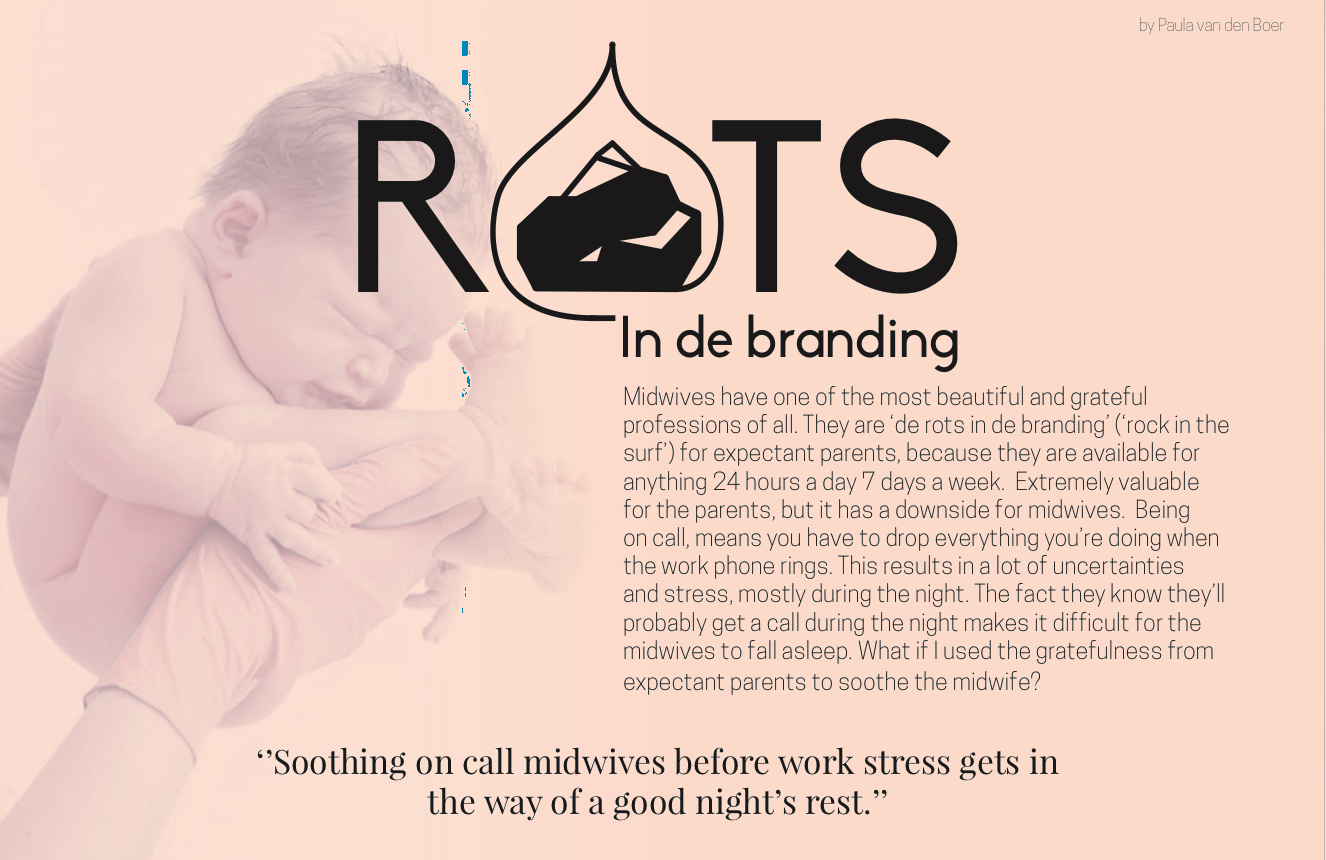
Rots in de Branding
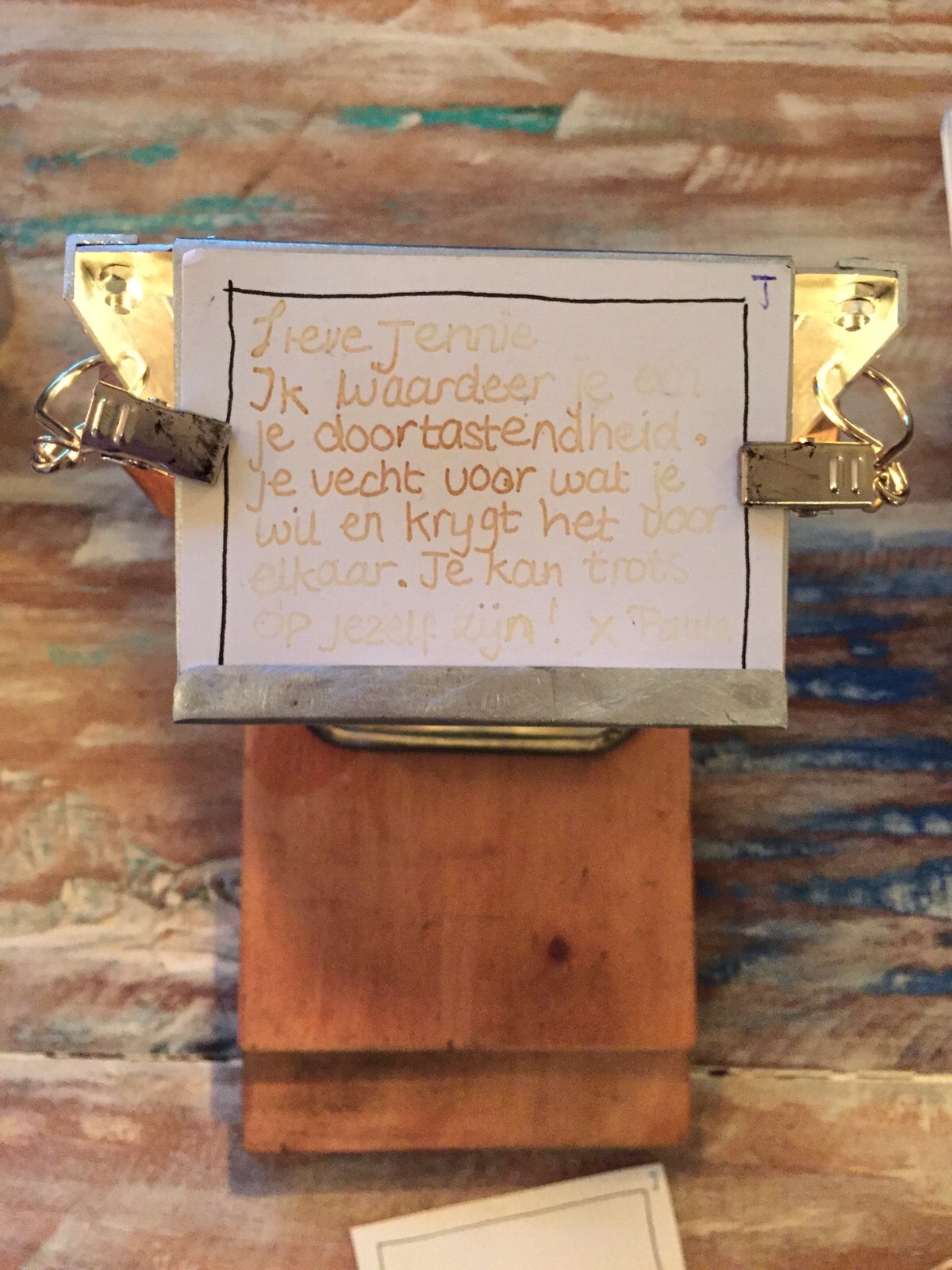
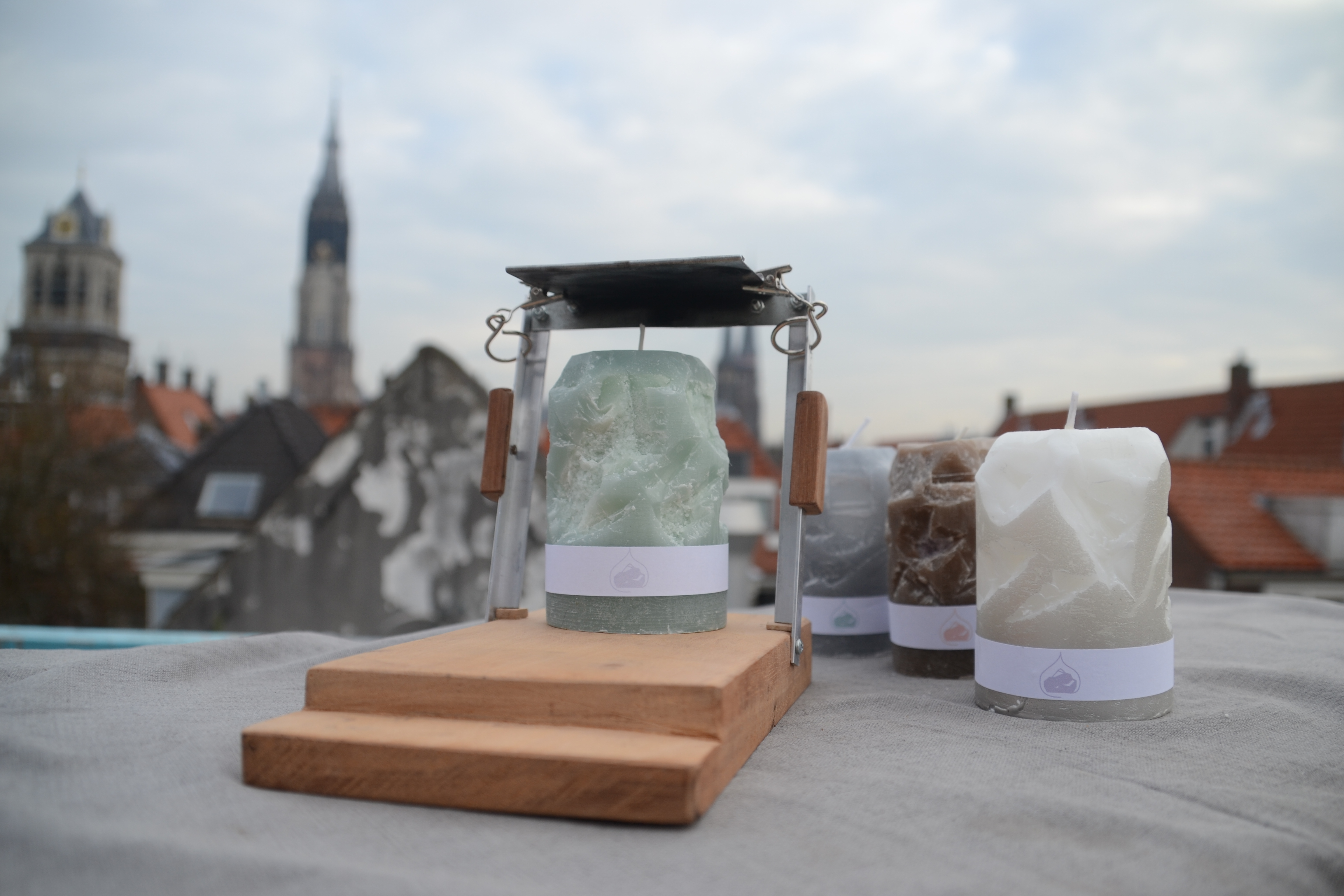
My concept is called ‘rots in de branding’ (Dutch saying, it literally means ‘the rock in the surf’) (VANDENBOER1.jpg), because midwives are ‘the tower of strength’ for expectant mothers. Mothers are able to write a message on paper with a lemon-juice-filled-pen to thank/appreciate the midwife. They can leave the written (invisible) note at the midwifery practice. When leaving the midwifery practice the midwife takes home the note and when she’s in bed she puts the note on the ‘rots in de branding’. She lights the aroma candle and waits for 10 minutes till she’s able to read the message (VANDENBOER2.jpg). She falls asleep soothed with the nice words from the expectant mother in mind..

Presentation
Poster